Colour Management
This is the key to bringing everything together, understanding what can be printed and how to achieve the most accurate colour takes understanding and action. We know our spectrophotometers from our densitometers, we calibrate and profile our system and convert your images with care.
If you’re up to speed on the use of ICC profiles, you’ll appreciate that soft proofing with the profile that will be used to print your images will allow you preview a good representation on your monitor providing it has been calibrated.
So, if you’re not so familiar let’s give you some useful insights…
Colour management is all about taking your supplied files whether .pdf, .tif, .jpg or .eps and converting them to ensure the best likeness possible based on the printing conditions that will be used.
Working with ICC profiles will not make a bad image good, it will just print it more accurately. Working with an incorrect ICC profile will produce unfavourable results.
A good place to begin is to keep your files in Adobe RGB 1998 or sRGB IEC61966-2.1,
Make sure they’re 8 bit and please don’t use LZW Compression
We will convert your files to achieve the best likeness on the media you select. If we have concerns about the colour we’ll contact you to discuss it.
Our preferred option is for you to book an appointment and come and see us to review the files and proof before signing off an edition.
Once the files are set when you order again you’ll get the same result again and again.

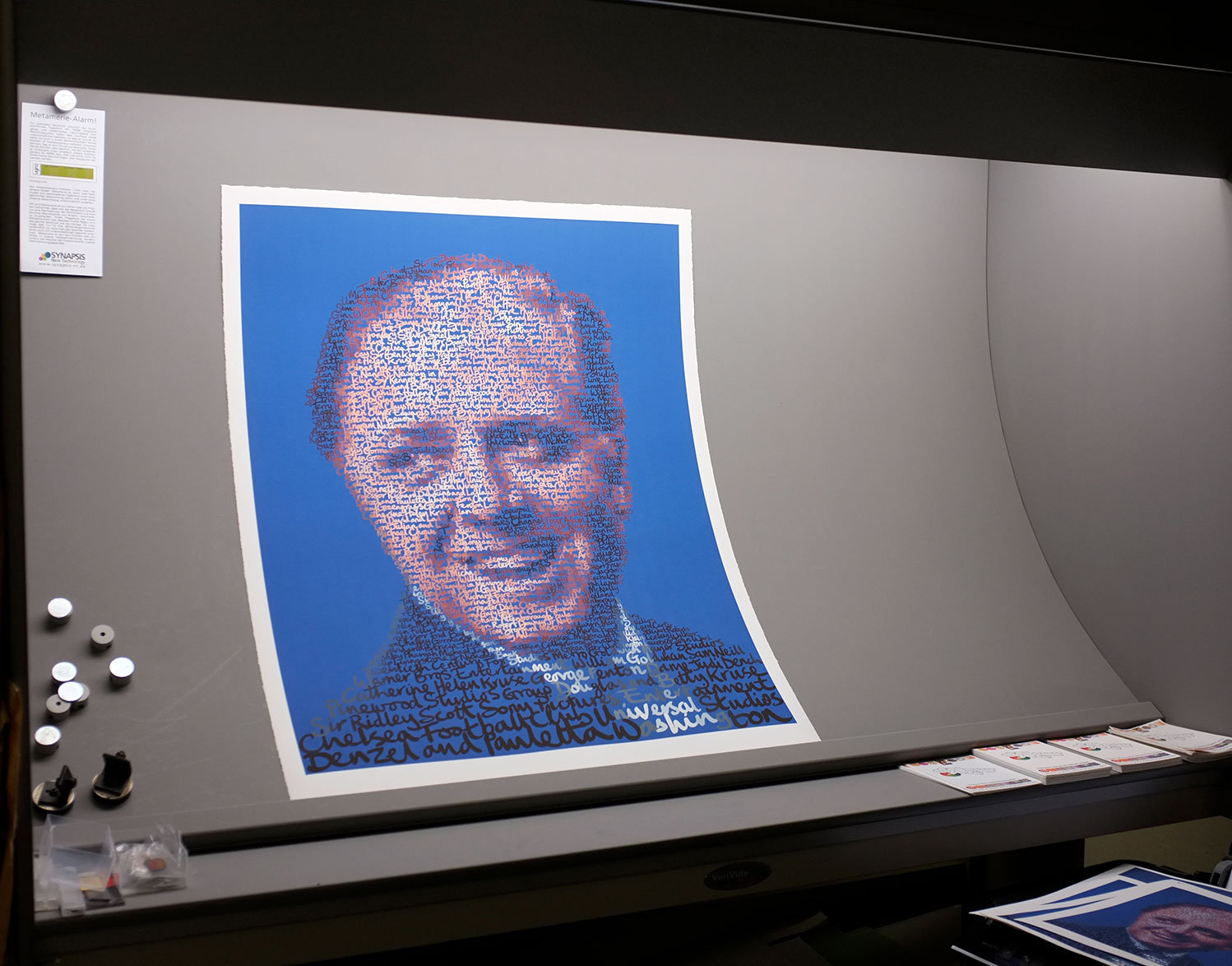
We also use a D50 light box to assess the colour quality of our editions. It provides a stable environment using daylight tubes to ensure quality control decisions are made no matter what time of day or night.

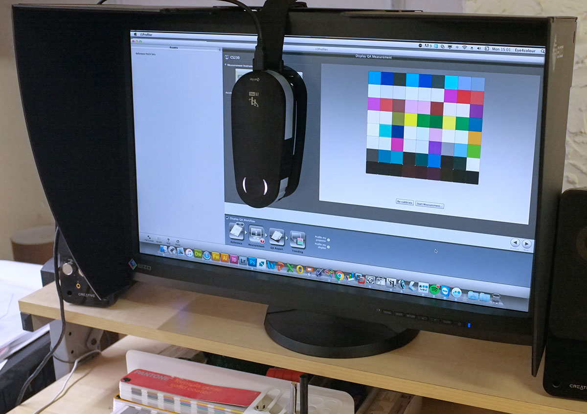
Here’s an Eizo monitor being calibrated using our X-Rite i1Pro 2 spectrophometer – This means that our monitor is reliable for retouching and soft proofing.

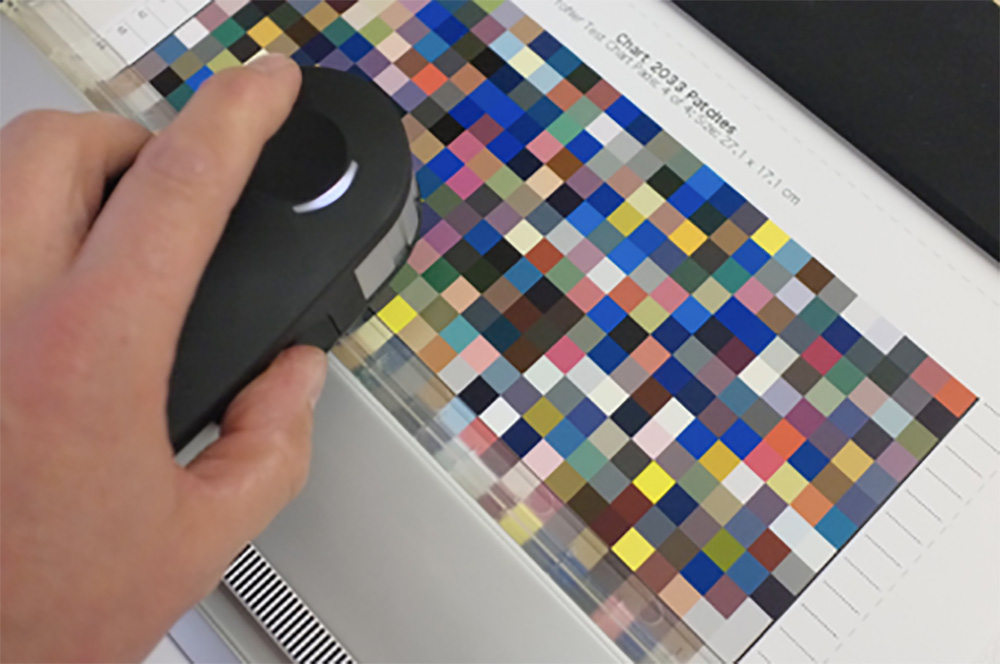
ICC profiling of media – We profile our media as every print system has it’s own fingerprint. Only custom profiling provides complete control.
In essence ICC profiling provides a method for us to see any colour compromises before ink ever hits paper. You can see here in these animations to range of printable colours on our most popular media.


This animation shows that Adobe RGB (1998) contains a wider range of colours than sRGB indicted in blue. We capture images using the Adobe RGB space and suggest that supplied files come in in the same format.
This animation shows the relationship between Adobe RGB (1998) gamut and the output gamut on Kodak Lustre 210gsm photographic paper
If you have any questions please go ahead and ask, we’re happy to share.
This animation shows the relationship between Adobe RGB (1998) gamut and the output gamut on Somerset Velvet 330gsm archival cotton rag paper
This animation shows the relationship between Adobe RGB 1998 and the output gamut on Epson premium semi gloss canvas.
